Vamos Outreach
Outreach tools for farmworker communities.
- Role
- UX Design Lead
- Organization
- Code the Dream
- Timeline
- April 2025 – April 2026
- Tools
- Figma, Storybook
- Status
- Shipped
Vamos is an outreach app used by organizations serving farmworker communities.
- Shipped to production
- Apr 2026
- User interviews run
- 8
- Design apprentices led
- 2
- Cross-team collaborators
- 10+
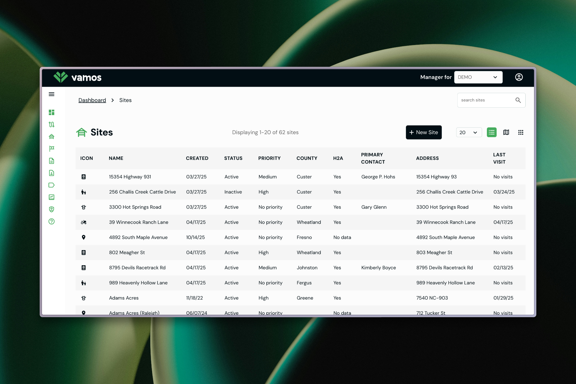
The problem
Confusing navigation. Customization buried. Web and mobile out of sync. Users worked around the app instead of with it.
Process
Discovery and research
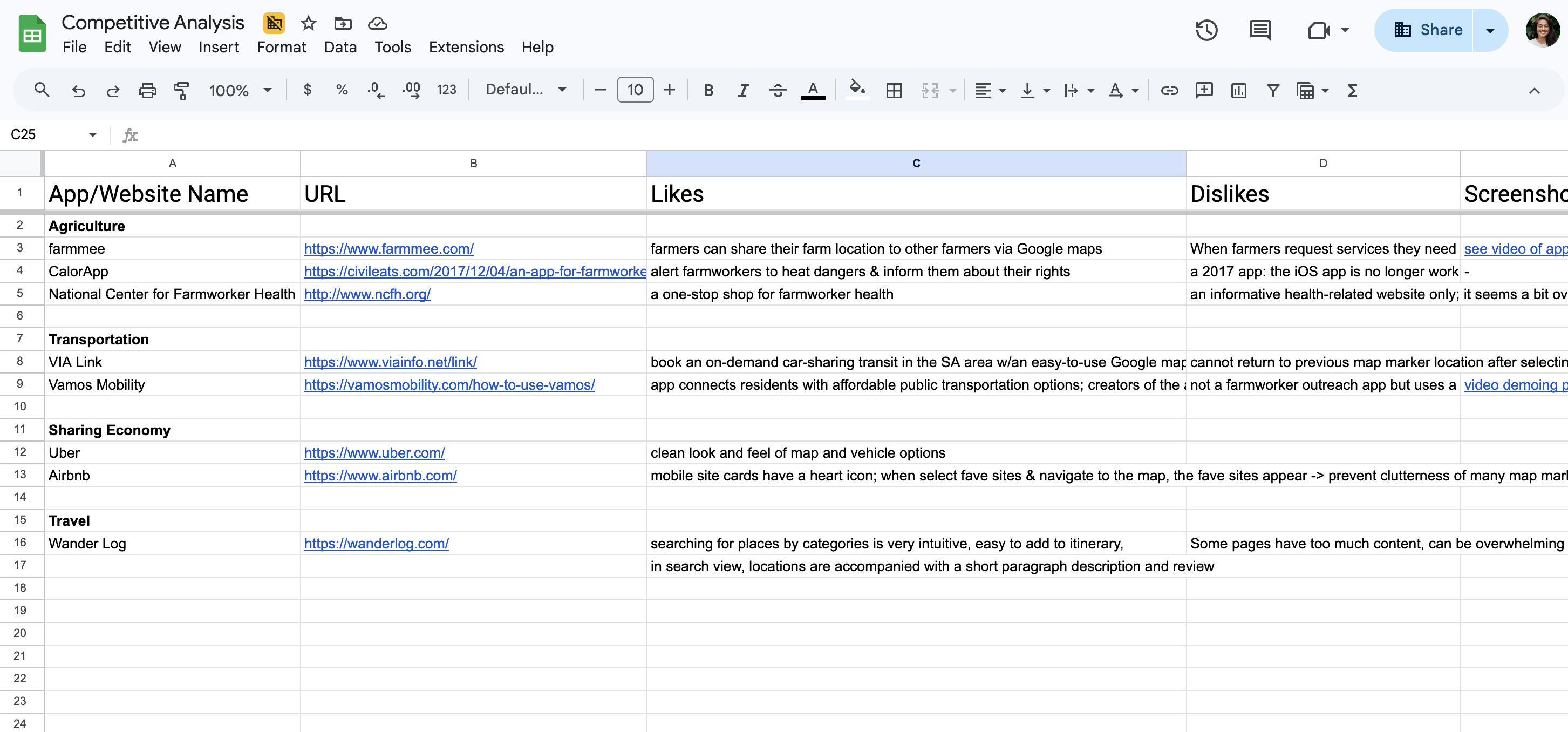
I ran 8 user interviews alongside stakeholder conversations and competitor analysis to understand how outreach workers and administrators used the app in the field and in the office.
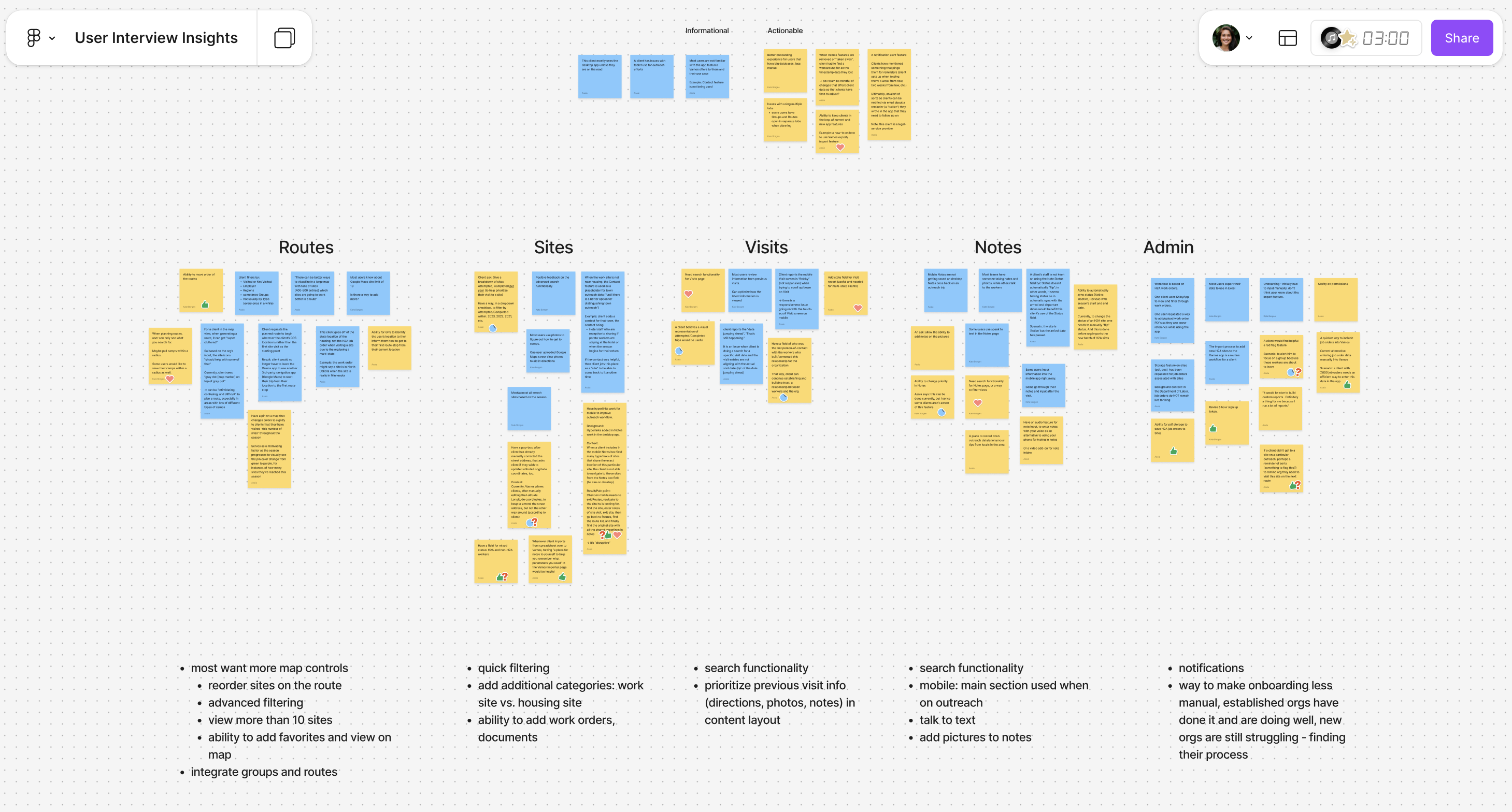
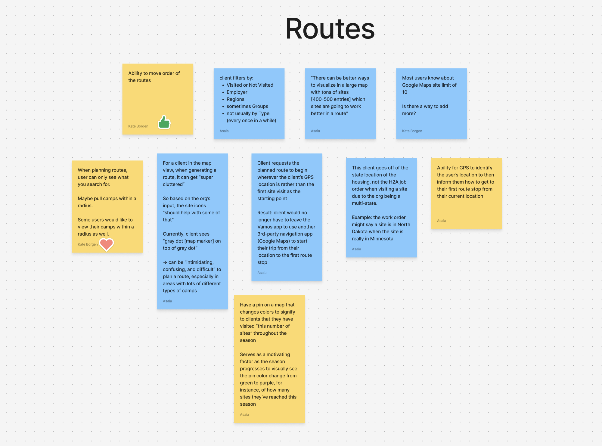
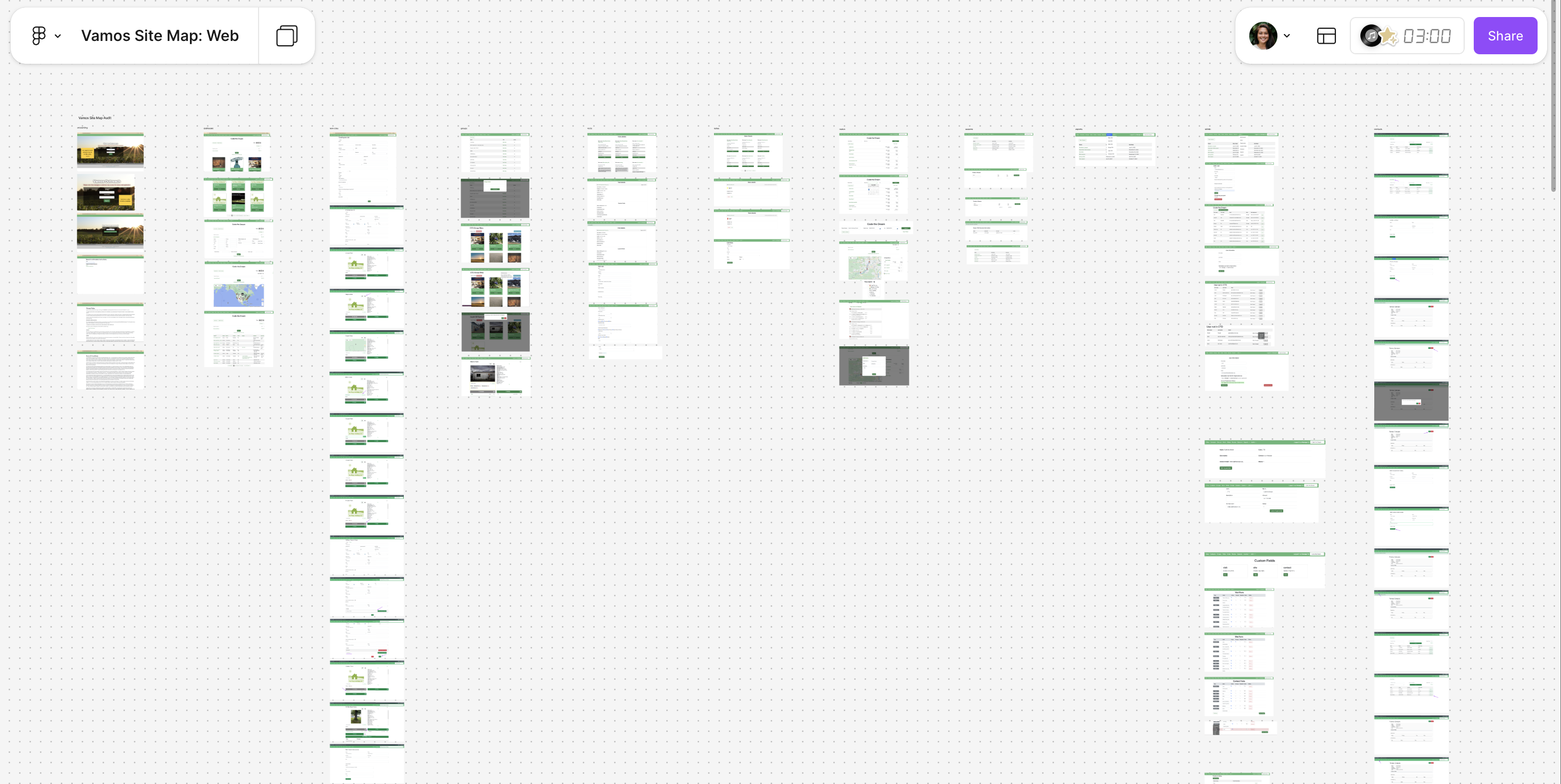
I built an affinity map in Figma, sorting interview notes into five columns: Routes, Sites, Visits, Notes, and Admin. The same three problems kept surfacing regardless of which part of the app a note came from.
Three findings shaped the work:
Finding 1: Customization was the app's strength and its biggest usability problem
The app offered flexible configuration tools for different outreach contexts — but they were hidden behind unclear navigation. Users didn't know they existed, or couldn't find them when needed.
Finding 2: Web and mobile served different users with different needs
Field workers used mobile; administrators used web. Both versions had the same layout and information hierarchy, ignoring the different contexts and tasks each group needed.
Finding 3: Onboarding was nonexistent
New users had no guided path into the app. They landed in the interface and figured it out through trial and error or by asking a colleague.
I focused on making the existing app more usable rather than adding new features. Three principles guided the redesign:
Surface what matters
Instead of adding features, I made existing ones findable — hidden customization tools moved into the primary navigation with clear labels.
Design for two contexts
I restructured the information hierarchy separately for web and mobile, matching how administrators and field workers each used the app.
Build a system, not a set of screens
I initiated a foundational design system in Storybook to bring visual and interaction consistency across the app and make it easier for future designers to contribute.
Key screens
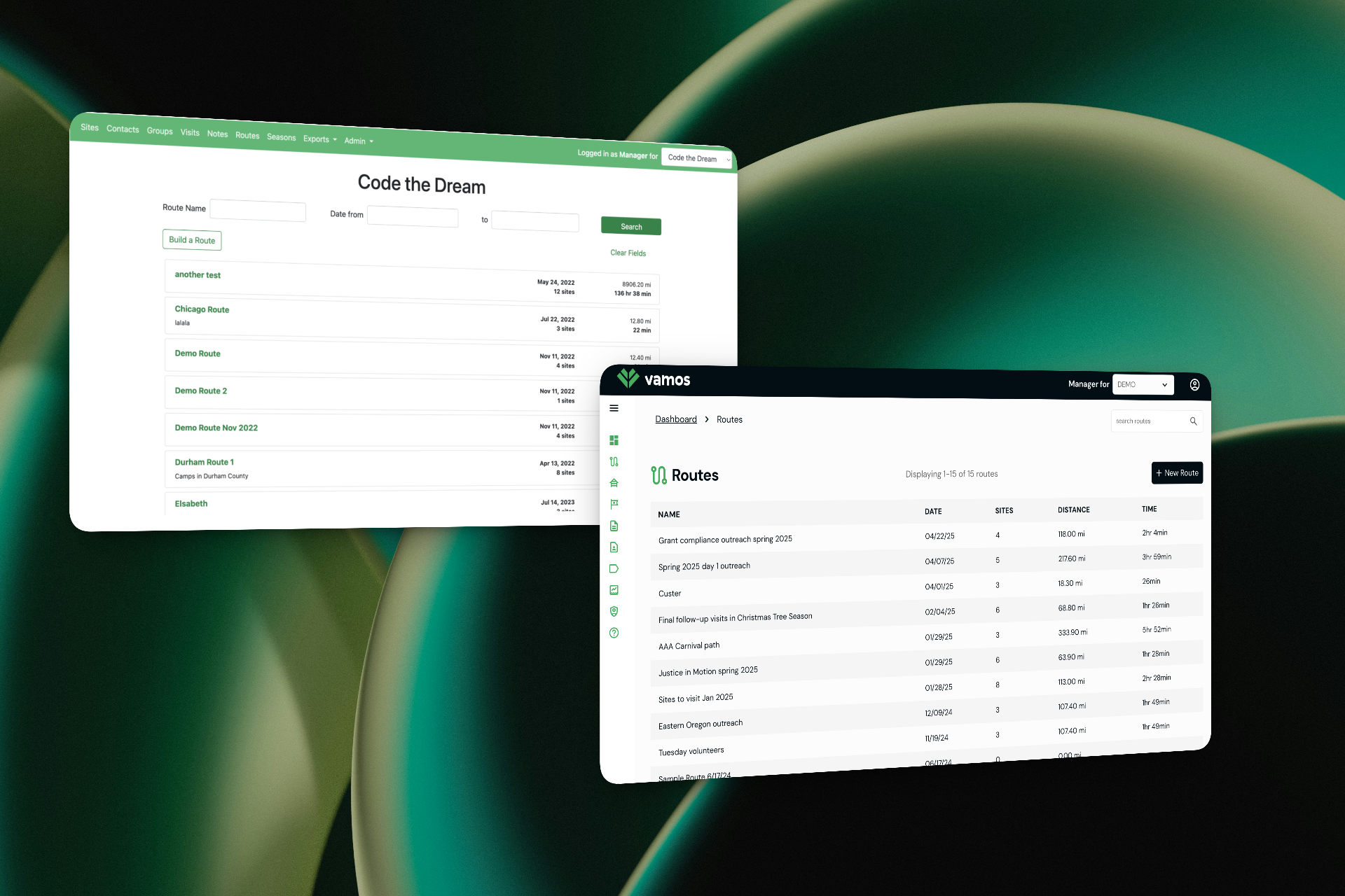
The routes list gives administrators a bird's-eye view of planned outreach trips.
Custom fields let organizations tailor data collection to their specific needs — the flexibility that made the app valuable, and the thing that had been buried.
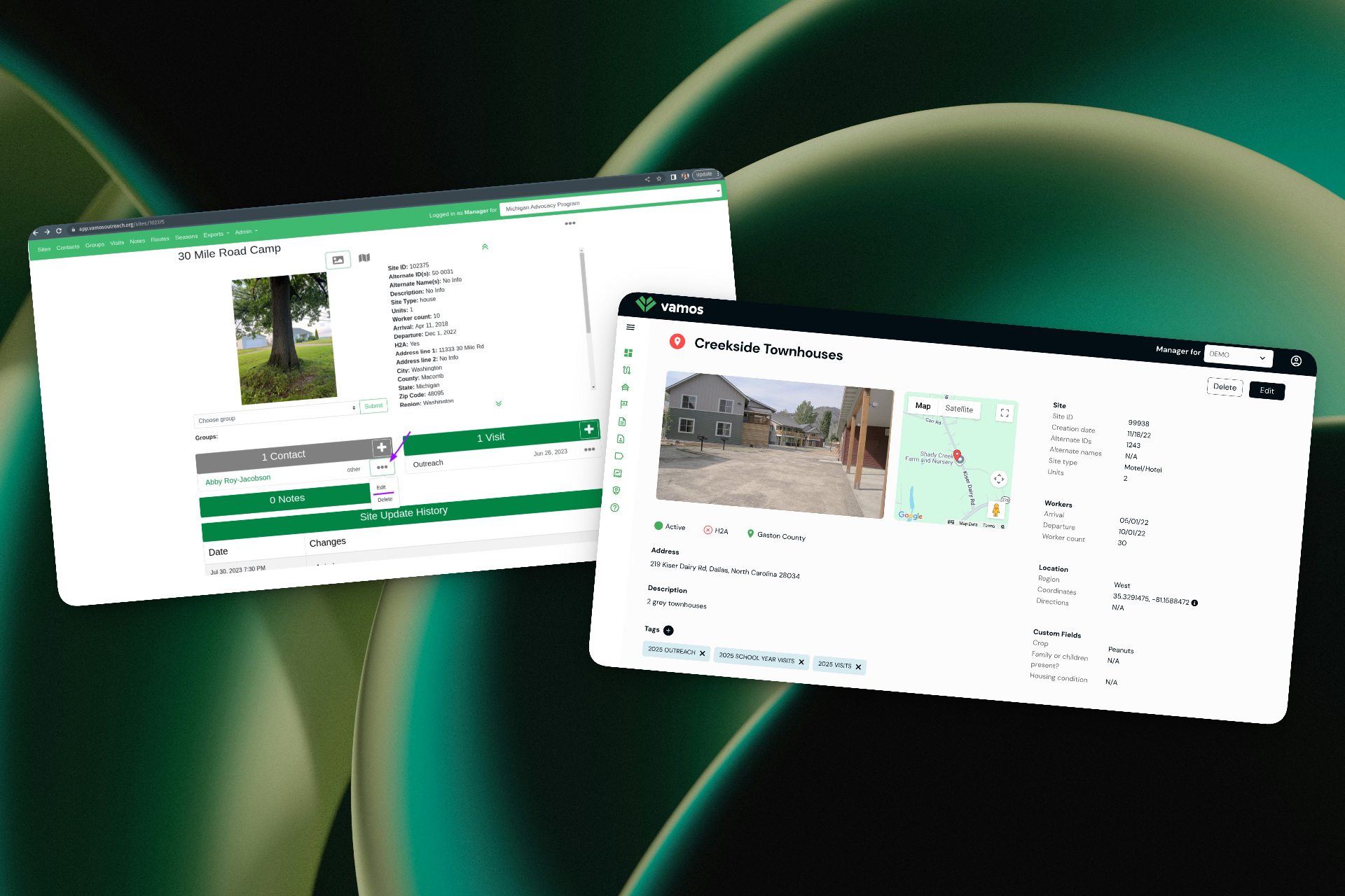
Site detail pages consolidate location, worker, and contact information for field visits.
Team leadership
I led a team of 2 UX design apprentices alongside developers and product stakeholders on a cross-team of 10+. I ran regular standups and weekly management meetings. When the team hit collaboration friction early on, I adjusted our processes to improve communication and handoffs.
I mentored the apprentices on design principles, Figma skills, and how to think through full user journeys rather than individual screens.
Results and impact
Over the course of a year, I delivered a redesigned information architecture, simplified navigation, a consistent web and mobile experience, and a foundational design system in Storybook. The redesign shipped to production in April 2026 and is live at app.vamosoutreach.org.
The new design surfaces the app's customization tools — its core value — in the primary navigation instead of burying them behind multiple clicks. And the restructured mobile experience matches how outreach workers actually use the app in the field, rather than mirroring the desktop admin layout.
What I learned
Leading a redesign on a live product serving vulnerable communities taught me that usability improvements have real downstream impact on the people being served: when an outreach worker finds the right tool faster, a farmworker gets better service.
Managing apprentices while running the design process pushed me to be more intentional about documentation and process. If I couldn't explain a design decision clearly enough for a junior designer to execute on it, the decision wasn't clear enough.