Learns Design System
One source of truth for design and development.
- Role
- Design Engineer
- Timeline
- October 2024 – Present, v3 in progress
- Status
- Shipped
The CTD Learns App had been built piece by piece by a rotating team of volunteers: tokens lived only in the codebase, designers worked from outdated Figma files, and engineers reimplemented the same components. The work wasn't to invent a design system — it was to make the one already in the code visible, browsable, and trustworthy enough to be the source of truth.
- Of app components previewable
- 100%
- Color tokens documented
- 33
- Type sizes in the scale
- 8
- Patterns documented
- 4
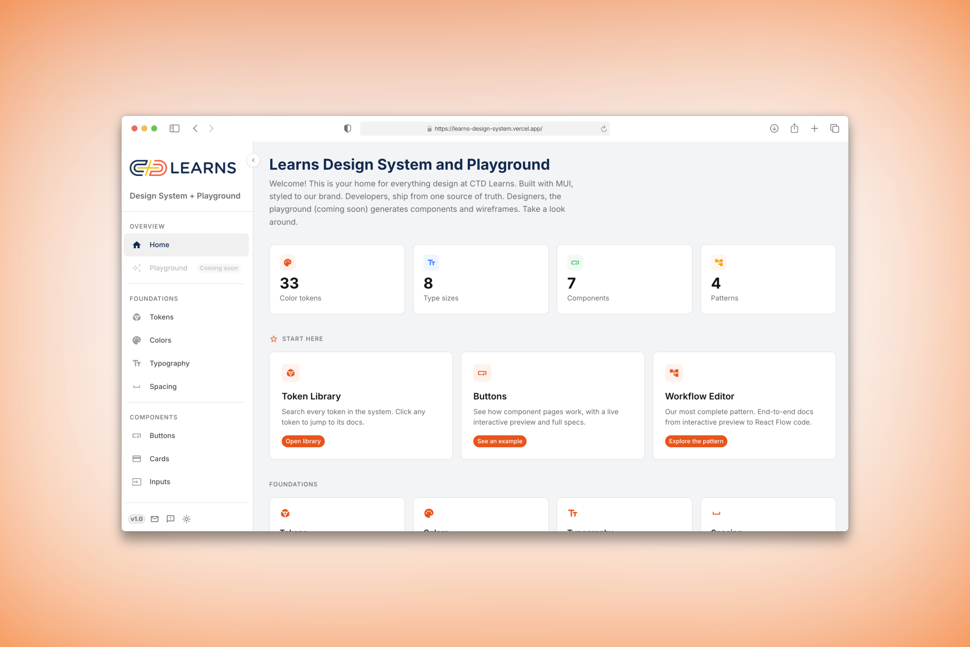
The problem: design and dev were drifting apart
Tokens lived only in code. Designers worked from outdated files. Engineers rebuilt the same components from scratch. Every feature added more drift.
The insight: the code was already a design system
A short audit of the existing codebase showed how much was already there, just not documented:
- 33 color tokens in
theme.js - 8 type sizes in the scale
- 7 components with custom theming
- 4 built-but-undocumented patterns
The work wasn't to invent tokens or components. It was to make what existed visible, browsable, and trustworthy enough to use as the source of truth.
The solution
I built a documentation site that mirrors the codebase exactly. Every page lives at the same URL pattern as the sidebar. Every component has the same structure: interactive preview, specs, code. And the master token table auto-generates from theme.js, so it can't drift from the code.
Results
- 7 components and 4 patterns documented — 100% of the app's components now previewable
- Foundations, components, patterns, and guidelines covered across the docs surface
- Live, mobile-responsive, dark-mode supported, and seeded with the team's real node types and example workflows — engineers see real data, not lorem ipsum
Growth path
MVP. Live for the CTD Learns engineering team: token glossary, every component documented, every pattern walkable end to end, with a feedback flow to capture what's missing.
Next. A designer playground for composing layouts with the same tokens engineers ship with — currently in design.
Scale. The architecture is project-agnostic: any CTD app on MUI can swap in its own theme file and inherit the entire docs surface.
Process
Theme as source of truth
Every value lives in theme.js. The docs read from it — the master Token Library and every live component preview render under the real theme, so a change in the code shows up in the docs on the next deploy with no hand-curating.
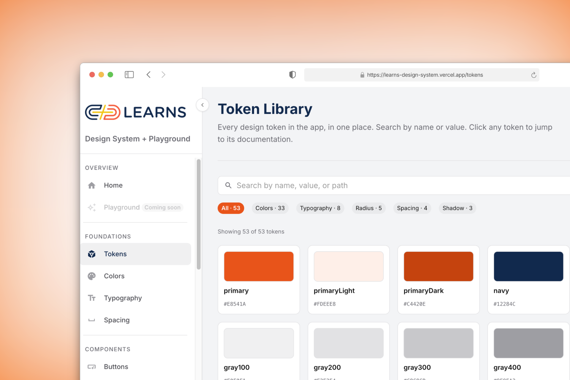
Interactive previews, not screenshots
Every component page has a live MUI playground: flip props, see the result, inspect the computed specs, copy the code. The same controls that change the preview update the spec sheet, so engineers see exactly which value comes from which prop.
End-to-end pattern docs
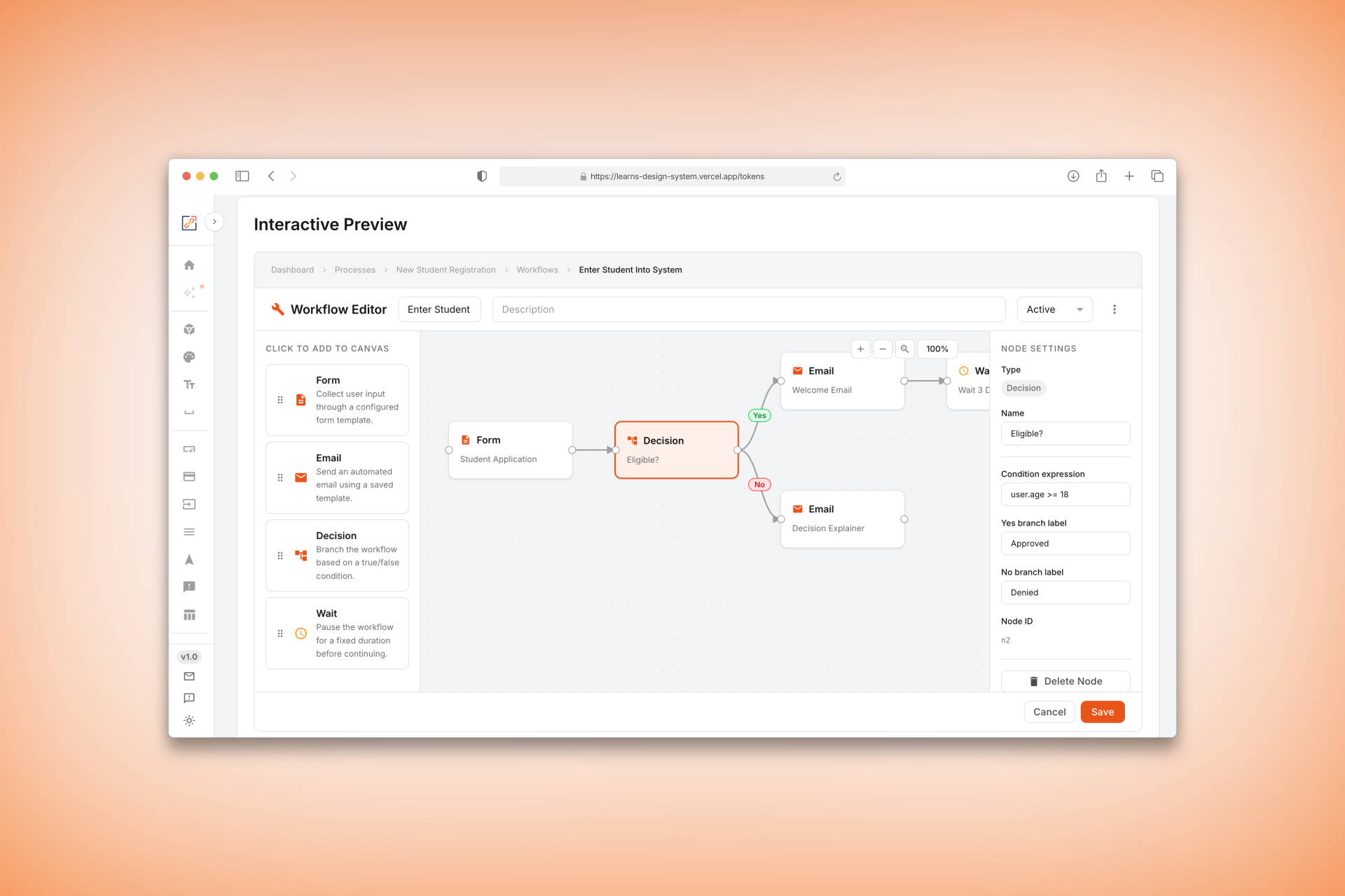
The most ambitious section is the Workflow Editor: a fully interactive React Flow canvas with pan, zoom, click-to-select nodes, and a live properties panel — documented alongside copy-pasteable code for every node type, custom handle, and styled edge.
Being honest about what's live vs. demonstrated
Two things I'd want an engineer reading this to know, because glossing them would read as inaccurate:
- The site is token-driven at the rendering layer, not fully generated. The master Tokens page enumerates the real
theme.jsobject and every preview uses the real theme — that's the honest "no drift" claim. The curated foundation pages (Colors, Typography, Spacing) still restate values to carry human-written usage prose, so those are a second copy that can drift. - The component generator is a demonstrated prototype, not the shipped authoring path. I built a Docker-inspired pipeline — spec + tokens in, a validated component out, with lint rules that reject hardcoded hex and enforce sentence-case buttons at generation time. It runs as a CLI and proves the concept, but it isn't yet how the site's own components are authored; the designer Playground is still in design.
The throughline: prompts as component specs
Working across design and engineering in one effort removed entire rounds of handoff translation. The generator's validator taught me to specify a component's constraints the same way I'd specify a prompt — exact tokens, exact rules, rejected at the door if they don't comply. It's the same instinct that shows up in my AI work: the interesting design lives at the layer where a specification meets what actually renders.
What I learned
The instinct with documentation is to create more. The real value was showing less and letting the source code speak — and optimizing existing workflows at the right points rather than replacing them.